
Dear all,
I have three questions regarding tha application of Cant.Z. circular logo on airplanes.
1) Was the circular Cant.Z. logo only applied to the Cant.Z. 506 Airone and 1007 Alcione, right?
Regarding military serie production aircrafts only:
2) The logo was red on the Biano Neve Cant.Z. 506 medical/rescue aircraft and on the first aircraft in alluminata/alluminiata paint, but was the logo still applied on later aircraft that left the factory in Dark Blue Grey? If affirmative, what was the logo's color?
Were there any differences between the logos applied by C.R.D.A. and Piaggio produced Cant.Z. 506s Airone?
3) The logo was light-blue on the Cant.Z. 1007s with the three-color "policiclica" camouflage of yellow/brown/green. Did it remain light-blue on the later aircraft in Verde Oliva Scuro? And on the few Alciones with the yellow basecoat with green spots?
Also for Cant.Z. 1007s were there any differences between the aircraft produced by C.R.D.A. and those produced by IMAM? Were Bianco Neve or Giallo Cromo ever used for the logo (as these two colours were mentioned as possible in some older publications)?
Thanks
Mario
Cant.Z. planes logo colours

Re: Cant.Z. planes logo colours
1) The CANT logo also appeared on the Z.506C (some), Z.509, Z.1011 and Z.1015 and likely on (some) civil and (almost all) military aircraft produced by CRDA after the Z.506. The upper part of the logo contained the script CANT, with the letter 'C' wrapping around the top-side of the oval forming a border and the lower half contained the aircraft number only (and bis) + the letter 'Z' wrapping around the lower halve of the oval forming the bottom border - the outer circular border was a 'C' (top) + 'Z' (lower) - its a neat logo. The logos appeared on both the port and starboard sides of the aircraft.
2) yes the CANT logo appeared on Z.506 finished in Grigio Azzurro Scuro 3. Most aircraft at the time were photographed in orthochromatic B&W film. This film was highly sensitivity to blue-light causing a sky to blow out or appear bright for example, while foliage and blues stood out brightly. The film was also sensitive to greens. Dark Reds & Oranges: because orthochromatic film lacked red sensitivity, subjects like dark red stripes, brick walls etc rendered unusually dark (often black - think about the dim red-lit room that this film was processed in). We know from color photos that the CANT logo was (light) blue and against dark backgrounds (in B&W photos) such as VOS2 or GAS3 (with limited dynamic range of the cameras of the time), the logo often appeared very light (blue).
- That's a good question about the logos on IMAM (bis) and later Piaggio built machines (ter), you'll have to find photos with the logo + MM and determine that, and let us know what you find. The logos appear to have been stenciled on and the stencils were likely ordered from CRDA - the stencils were just the name of the aircraft.
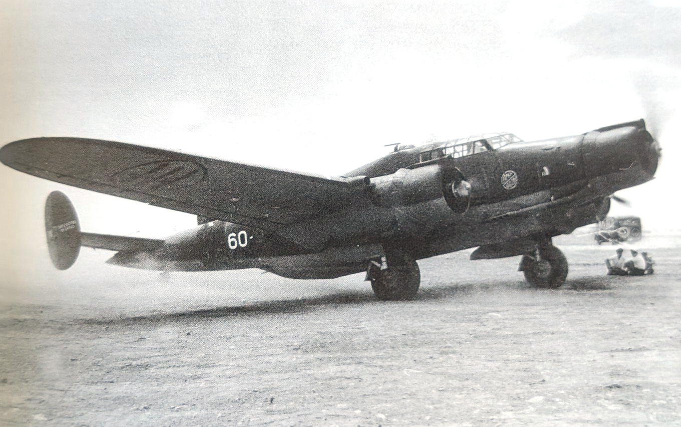
3) yes the logo remained light blue (from photos and discussion in 3) ) even in the continental scheme. Alciones finished in the two-tone scheme sand+dark green were either late serie built machines or over-hauled. A clue to an overhauled machine is to note the undersurface color of the logo (still in its factory color) since field units lacked the stencils they masked over the logo or painted over it. Evidence suggests the logo color was blue. There might be exceptions but only color photographs can clear this up. I do not think the logo was Bianco Neve (eg in the 4th photo below, compare the white squadriglia number "60" to the logo) or Giallo Cromo. Pre-war Z.506 with the red-bolt running along the side of plane - red-logo. In regard to IMAM (Naples) built -bis, the plane's performance was considered not as good as those built by CRDA (Monfalcone) - due to construction issues. Often planes in general, when constructed by various firms could be differentiated by their (paint) finish eg MC.202, Bf.109 etc.
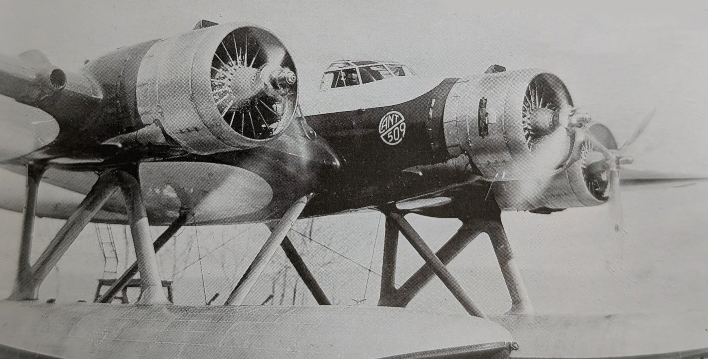
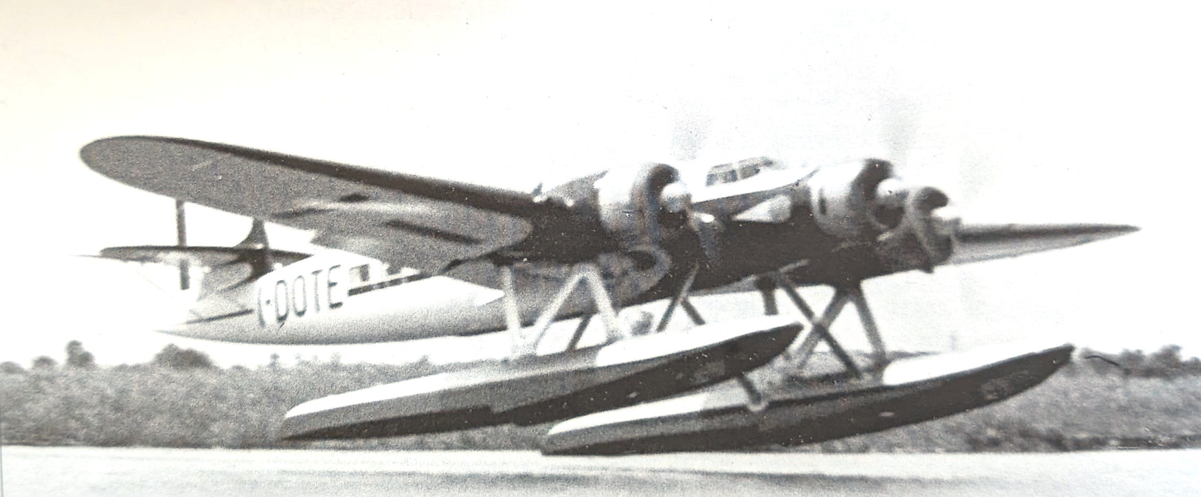
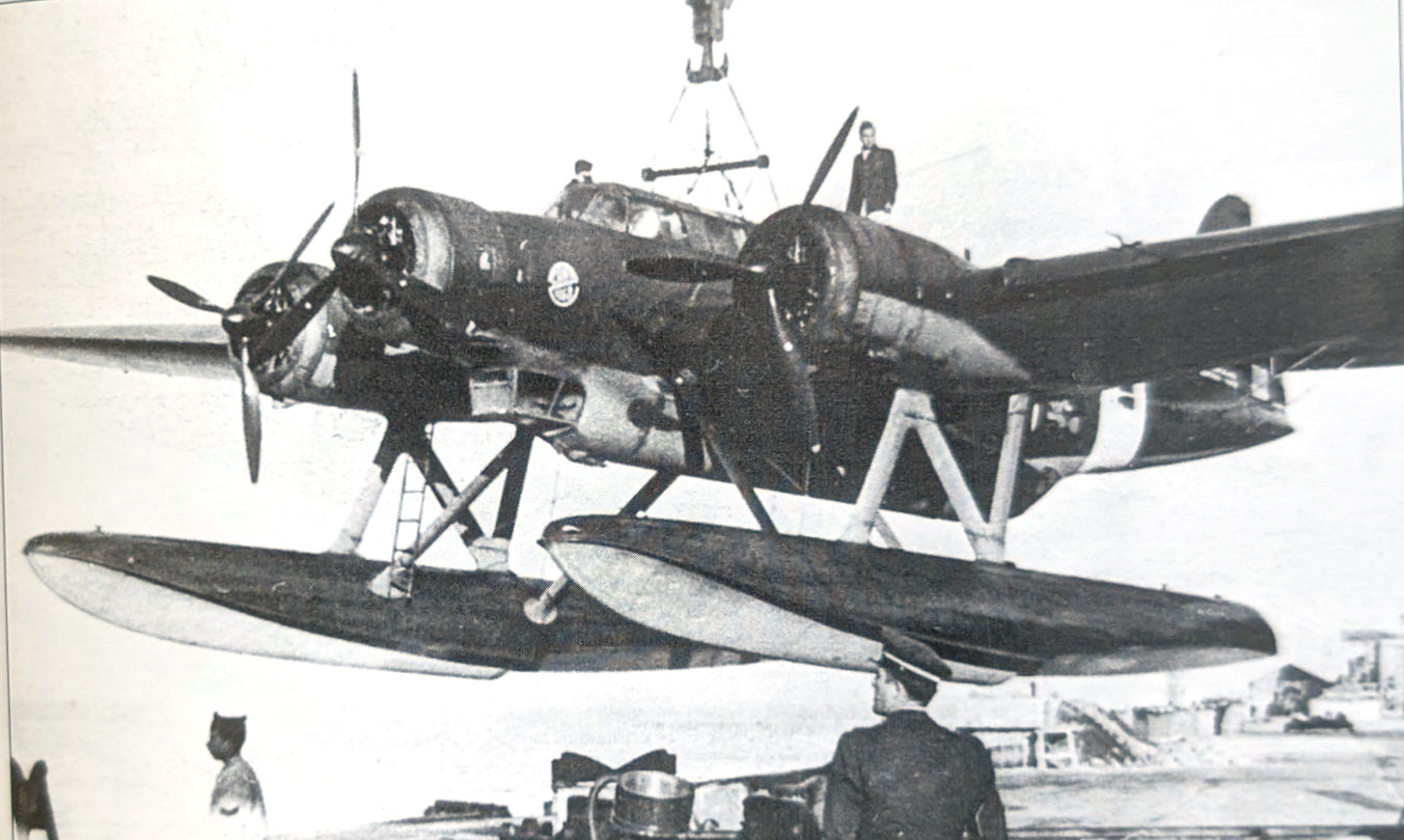
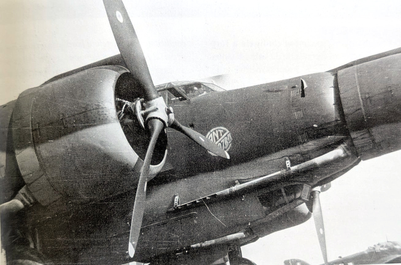
2) yes the CANT logo appeared on Z.506 finished in Grigio Azzurro Scuro 3. Most aircraft at the time were photographed in orthochromatic B&W film. This film was highly sensitivity to blue-light causing a sky to blow out or appear bright for example, while foliage and blues stood out brightly. The film was also sensitive to greens. Dark Reds & Oranges: because orthochromatic film lacked red sensitivity, subjects like dark red stripes, brick walls etc rendered unusually dark (often black - think about the dim red-lit room that this film was processed in). We know from color photos that the CANT logo was (light) blue and against dark backgrounds (in B&W photos) such as VOS2 or GAS3 (with limited dynamic range of the cameras of the time), the logo often appeared very light (blue).
- That's a good question about the logos on IMAM (bis) and later Piaggio built machines (ter), you'll have to find photos with the logo + MM and determine that, and let us know what you find. The logos appear to have been stenciled on and the stencils were likely ordered from CRDA - the stencils were just the name of the aircraft.
3) yes the logo remained light blue (from photos and discussion in 3) ) even in the continental scheme. Alciones finished in the two-tone scheme sand+dark green were either late serie built machines or over-hauled. A clue to an overhauled machine is to note the undersurface color of the logo (still in its factory color) since field units lacked the stencils they masked over the logo or painted over it. Evidence suggests the logo color was blue. There might be exceptions but only color photographs can clear this up. I do not think the logo was Bianco Neve (eg in the 4th photo below, compare the white squadriglia number "60" to the logo) or Giallo Cromo. Pre-war Z.506 with the red-bolt running along the side of plane - red-logo. In regard to IMAM (Naples) built -bis, the plane's performance was considered not as good as those built by CRDA (Monfalcone) - due to construction issues. Often planes in general, when constructed by various firms could be differentiated by their (paint) finish eg MC.202, Bf.109 etc.

Re: Cant.Z. planes logo colours
Many thanks Administrator,
can I know your name?
I will let you know if I will find something about IMAM and Piaggio's logos.
Mario
can I know your name?
I will let you know if I will find something about IMAM and Piaggio's logos.
Mario